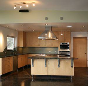
Create a Timeless Kitchen with the 4 Cs of Kitchen Design

Nothing says “dated” like a kitchen trend from a decade ago. Consider giving your kitchen a makeover using timeless elements that are always in style. That way, no matter when you sell, your home is always ready.
Color
The simplest and most marketable hue for a kitchen is a clean, bright white. Look in any kitchen design magazine and you’ll see a white theme throughout its slick pages. White reflects light and can make even a small kitchen appear larger. Of course, there are dozens of shades of white that evoke differing moods from cool and crisp to warm and comforting. You can even mix whites to give your kitchen depth and dimension.
No matter what your price point, all standard kitchen elements from appliances to finishes come in shades of white. If you DIY, you can find white tiles, paints, appliances, trims, sinks and cabinets.
Cabinets
Speaking of cabinets—the most timeless cabinet design is the Shaker style. A true Shaker style is a flat panel door with a square frame known as rail and stile construction. You’ll find Shaker style cabinets in country cottages, contemporary lofts and classic homes. If made from fine wood, a simple polyurethane finish will display the wood’s beauty, but as in the section above, a white cabinet paint or finish will keep your kitchen beautiful for years to come.
Shaker-style cabinets span all price ranges and quality levels. You can remodel your entire kitchen or simply replace the doors and drawer faces. In fact, if your kitchen has odd-sized custom cabinets or door and drawer sizes from another era, and you’re handy with tools and looking for a budget-friendly solution, you can even make your own.
Counters
The third “C” is the countertops. From Formica to granite, countertops are the most used part of the kitchen. While Formica definitely shouts, “dated,” to most buyers, granite is beginning to be cliché as well.
The most timeless surfaces for your countertop include:
- White/black marble
- Soapstone
- Slate
- Natural tile
- Butcher-block
- Concrete
Solid-surface materials such as Okite, Silestone or Corian in designs that mimic marble, stone or lighter granites and neutral colors promote an enduring look. Better for your pocketbook are butcher-block and concrete surfaces.
Cookspace
Classic kitchen layouts make moving from countertop to cooktop, refrigerator to sink or cutting board to oven simple. The most classic are: I, G, C or L configurations.
- I — The “I” kitchen is a simple, single-sided galley and works great for small spaces such as lofts and smaller apartments. In an open space it only requires one wall, and adding an island opposite can create a full galley.
- G — The “G” is a full galley kitchen with workspace on two opposing sides. The best arrangement has a prep area equidistant from both the sink and the cooking space.
- C — A “C” (also called “U”) kitchen has cabinets on three sides. In an open design one side would be a peninsula. Busy bakers and cooks like the C or U shape for its large amount of counter space and classic work triangle.
- L — An “L” kitchen has cabinets against two perpendicular walls and often has a center island. Popular in open floorplans, the L-shape has plenty of space and two walls of cabinets. Typically, the sink is on an exterior wall with a window to let in light.
If your kitchen is not one of these classic layouts, consider moving some things around to mimic these designs.
If you’re thinking of selling your home, let us give you a professional evaluation of your current kitchen before you spend to redesign it. We can help you determine which changes will give you the best return on your investment.
Compliments of Virtual Results


What Others Are Saying